
Why Color Matching Matters: The Art and Science of Custom Cashmere Color Development
A designer once told me:
"If the color is even slightly off, the entire room feels off."
They weren't exaggerating.
In luxury interiors, every material contributes to a larger visual story. Fabrics, wall coverings, flooring, furniture, lighting, and decorative accents all work together to create a cohesive environment. Even the smallest deviation in color can disrupt the balance of a carefully considered design scheme.
A throw draped across a sofa, a bed runner at the foot of a bed, or a collection of cushion covers may seem like minor elements within a room. Yet these details often play an important role in tying a space together.
This is why custom color development has become such an important part of our work at Arihant Collection.
Beyond Stock Colors
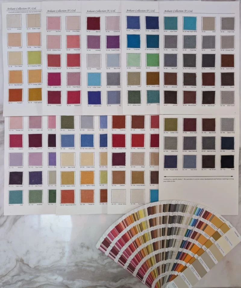
Over the years, we have developed a library of more than 170 stock colors across our handwoven cashmere collections.
For many projects, these existing shades provide an excellent starting point. However, luxury residential, hospitality, and retail projects frequently require something more specific.
An interior designer may need to match an existing upholstery fabric. A hospitality brand may have a carefully defined color palette that must remain consistent across multiple properties. A retailer may be developing a private collection around a unique seasonal color story.
In these situations, selecting a stock color is often only the beginning.
The objective becomes creating a textile that integrates seamlessly into the larger design vision.
Why Matching Cashmere Is Different
At first glance, color matching might appear straightforward.
A designer provides a Pantone reference, a fabric swatch, or a physical sample, and the manufacturer reproduces that color on the finished textile.
In practice, the process is considerably more complex.
Cashmere is a natural fiber, and natural fibers do not behave like synthetic materials. The way cashmere absorbs dye can be influenced by a variety of factors, including the characteristics of the fiber itself, the dye formulation, processing conditions, and environmental variables.
A color that appears perfect on paper may behave differently once applied to yarn.
Similarly, a color that looks accurate under one lighting condition may appear slightly different under another.
Achieving an accurate match requires more than following a formula. It requires testing, evaluation, adjustment, and experience.
The Development Process
Every custom color project begins with understanding the client's objective.
Sometimes the reference is a Pantone standard. Other times it may be an existing textile, paint sample, finish material, or physical object that forms part of the overall design concept.
From there, dye development and sampling begin.
Small sample runs allow us to evaluate how the color appears on the cashmere yarn itself. Adjustments are often made to refine the tone, depth, warmth, or saturation until the desired result is achieved.
The process may appear incremental, but these refinements often make a significant difference in the final outcome.
Particularly in luxury interiors, subtle variations can be highly noticeable once the textile is placed within the finished environment.
The Importance of Consistency
Color matching is not only about achieving the correct shade once.
It is equally important to maintain consistency throughout production.
Whether creating a limited collection for a boutique retailer or producing textiles for a hospitality project with multiple installations, consistency ensures that every piece aligns with the original approved standard.
This reliability allows designers and project teams to move forward with confidence, knowing that the final products will support the broader design vision.
When the Match Is Right
One of the most interesting aspects of successful color development is that it often goes unnoticed.
Clients rarely walk into a room and immediately comment on a perfectly matched bed runner or throw blanket.
Instead, they experience a sense of harmony.
The textile feels as though it naturally belongs within the space. Nothing appears out of place. The colors work together effortlessly.
In many ways, that is the true objective of custom color development.
Not to draw attention to the textile itself, but to ensure that it contributes seamlessly to the overall design.
Small Details, Lasting Impact
Luxury interiors are built upon countless decisions.
Some are highly visible. Others are subtle enough that most people never consciously notice them.
Color matching belongs to the second category.
Yet it is often these details that determine whether a space feels cohesive, refined, and intentional.
At Arihant Collection, custom color development allows us to create handwoven cashmere textiles that support the broader vision of designers, retailers, and hospitality teams around the world.
Because sometimes the difference between a good project and an exceptional one comes down to a color that feels exactly right.
